We’ve come a long way since we made our original Sam&Mark branding and felt it was time to do a rebrand that represented where we were now as a company. Heavily inspired by our desert surroundings, our rebrand looks a lot like what we sit and stare at on our front porch every day.
Sam&Mark
CLIENT
- Sam&Mark
STRATEGY & DESIGN
- Sam&Mark
WEBSITE DEVELOPMENT
- Bike Bear
SCOPE
- Brand Discovery
- Strategy
- Logo
- Typography
- Color
- Motion Design
- Photography
- Website Design
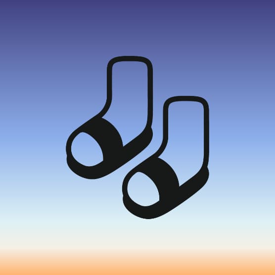
OLD LOGO / NEW LOGO
Since the beginning, the socks and sandals logo just felt right to us. It somehow perfectly represents all of our idiosyncrasies. We simplified the socks and sandals as much as possible without sacrificing legibility. We also made the logo into a 3D asset and rigged it for animation.
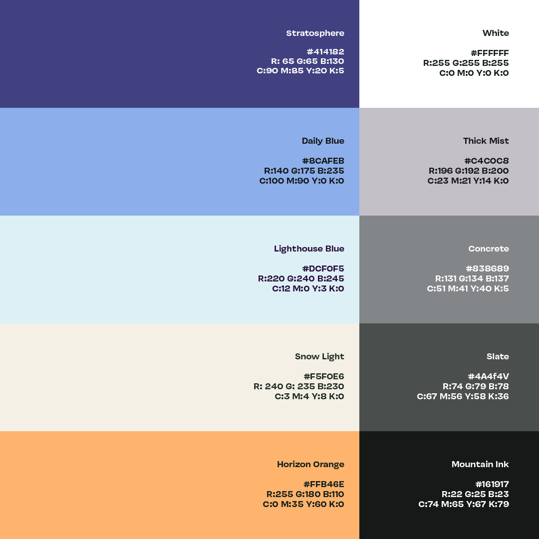
COLORS
Our colors are directly inspired by the desert sky. We took a lot of photos of the sky, then sampled and tweaked the colors until we had a set we liked. When you put the colors together, they represent the different gradients you see in the sky in the morning, afternoon, and evening.
COLOR PALETTE
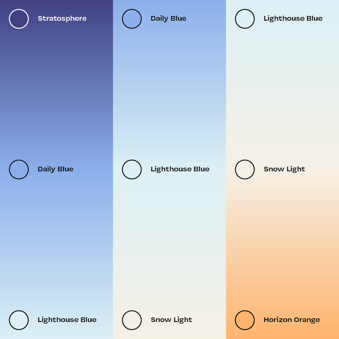
GOLDEN HOUR GRADIENT

SUPPORTING GRADIENTS
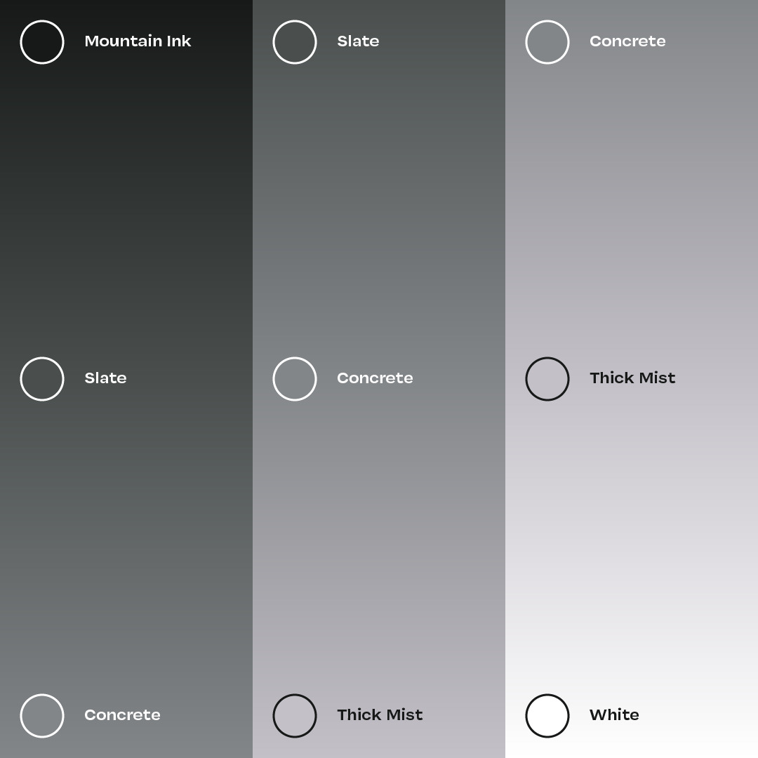
SUPPORTING GRAY-DIENTS
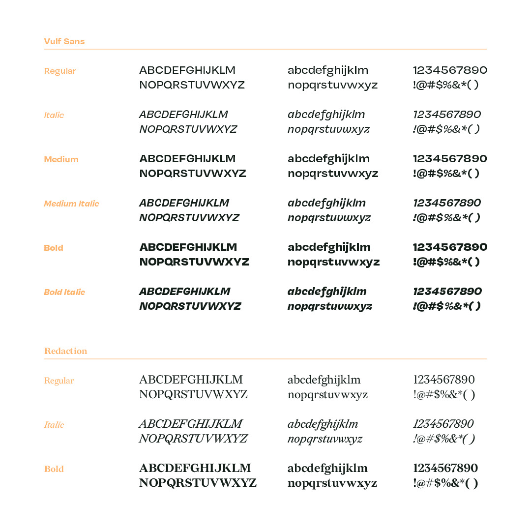
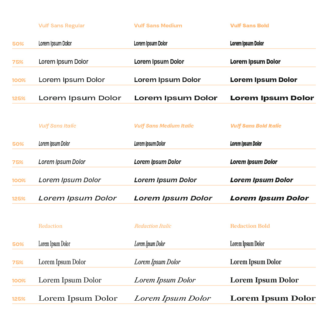
TYPEFACES
Vulf sans is our badass-do it all typeface with lots of personality and clarity. We use it for any and all brand applications. Redaction acts as a moody compliment to Vulf Sans, we use it for the most biting headlines and punchlines.
STRETCHED TYPE
Typically, stretching text is a graphic design no-no, yet there’s something undeniably charming about seeing stretched type in your friendly neighborhood signage. We wanted to explore how this taboo design technique could be tastefully used to add character to our brand identity.
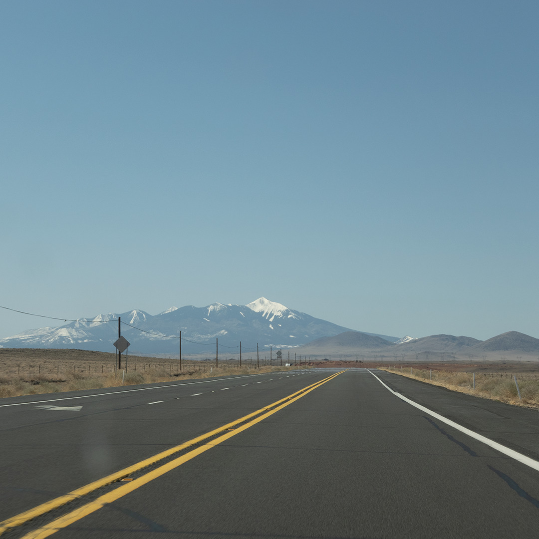
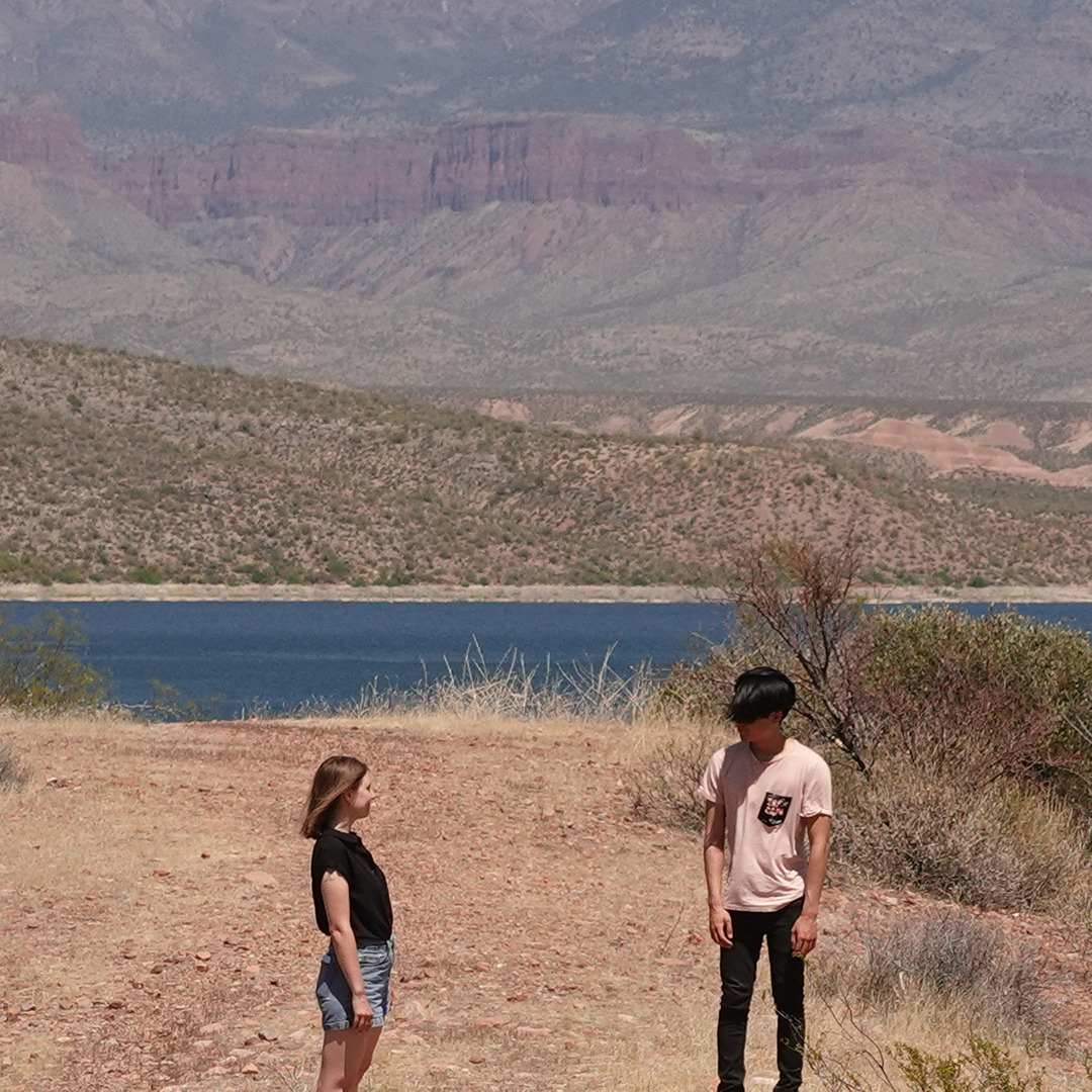
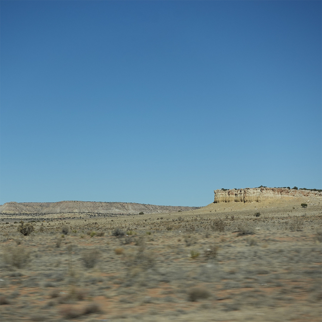
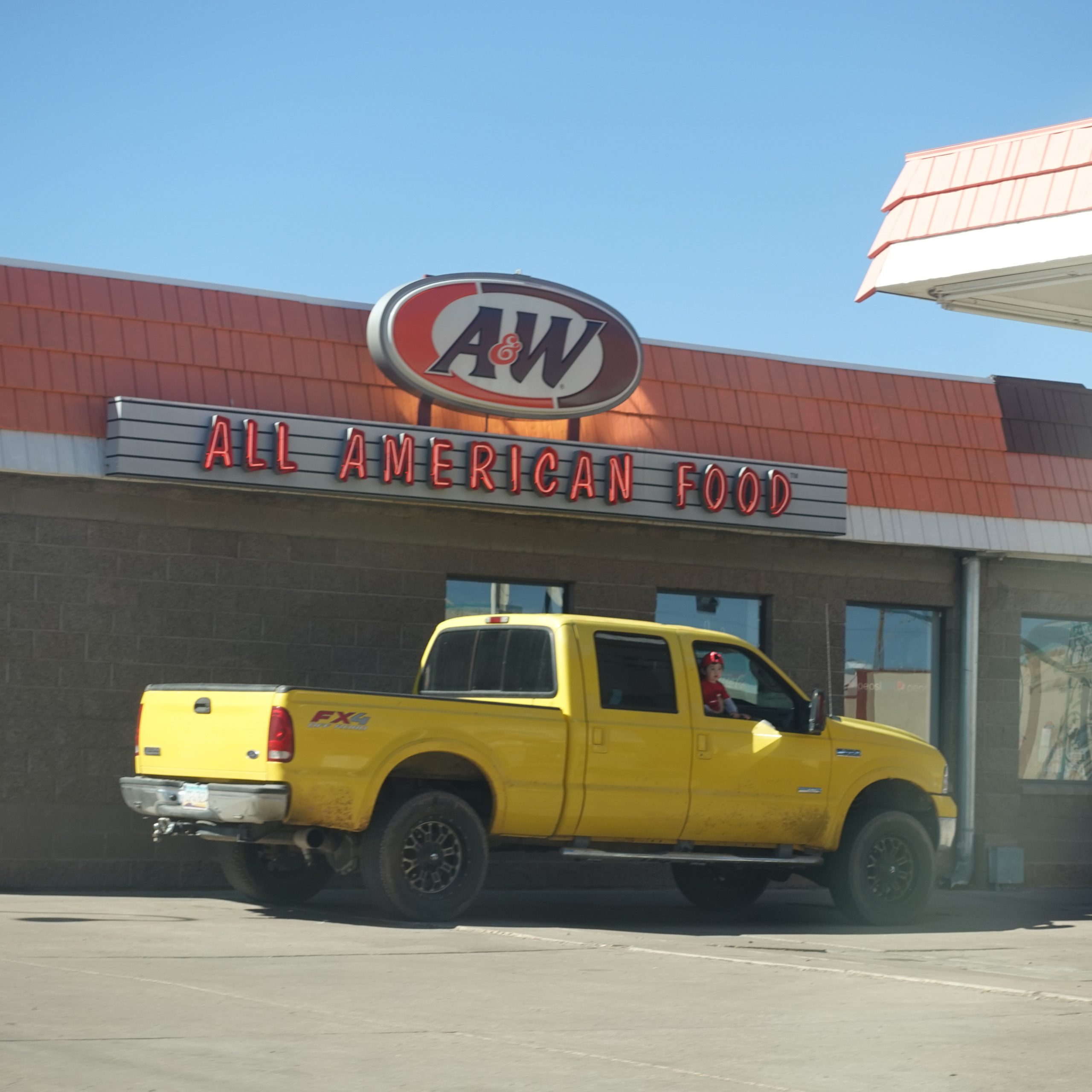
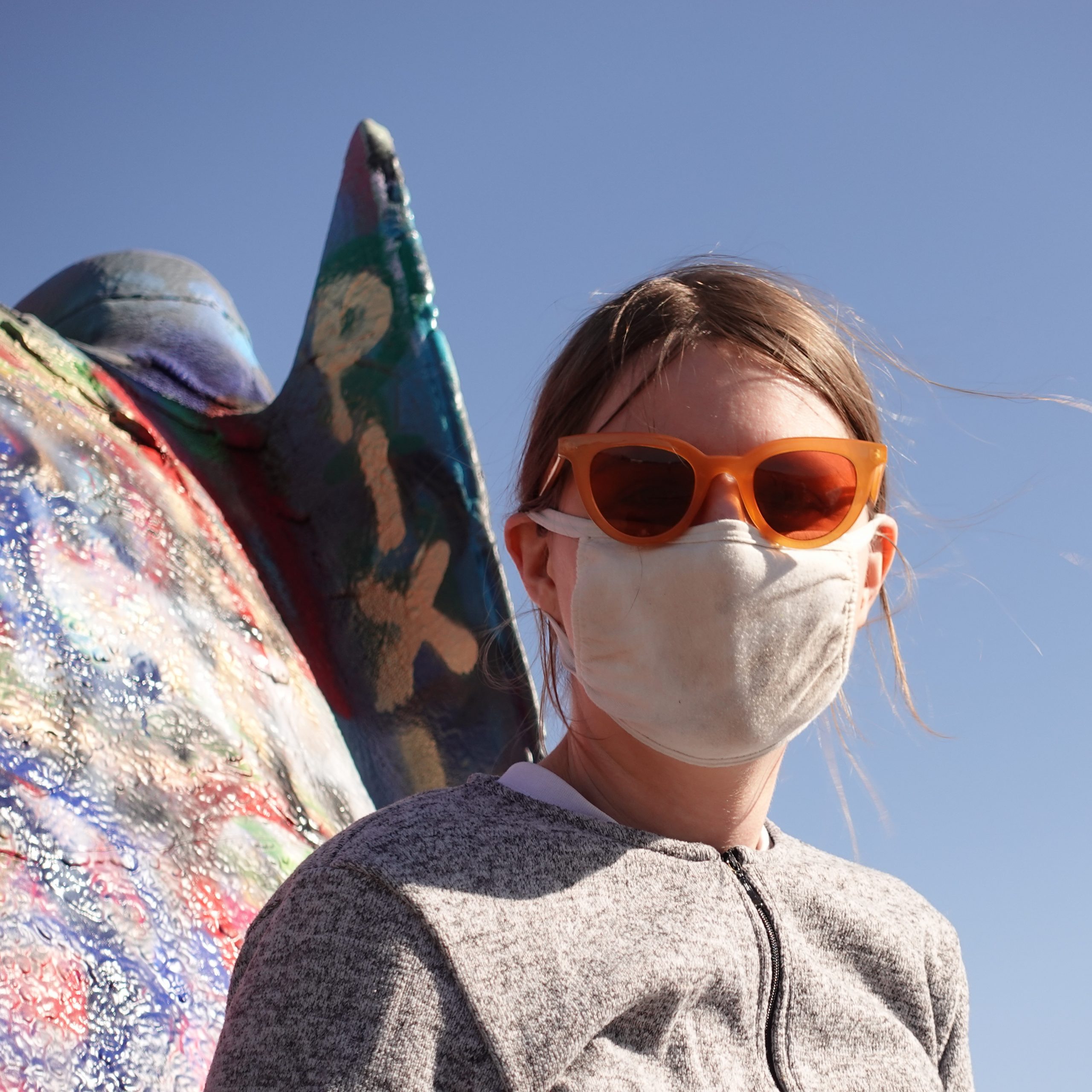
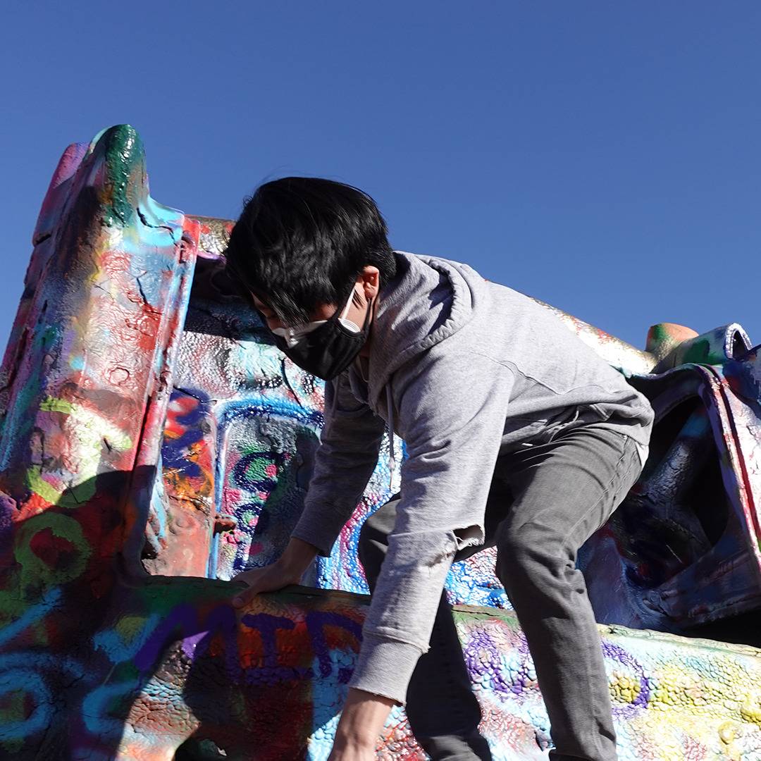
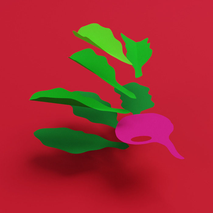
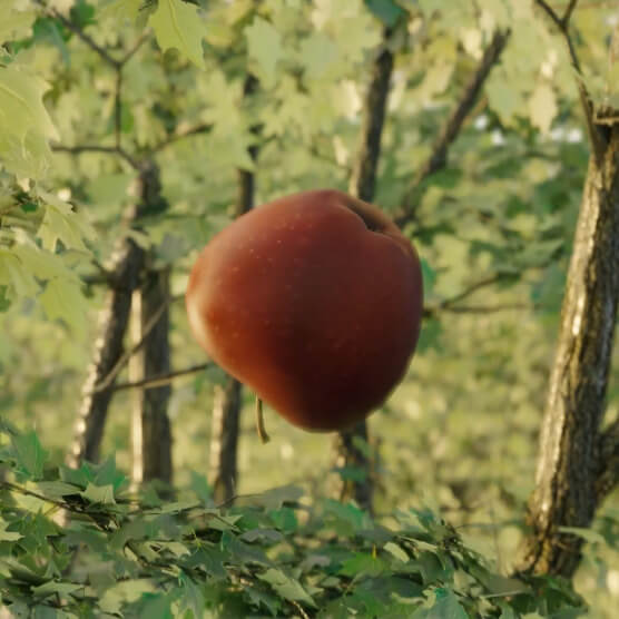
PHOTOGRAPHY
With photography, our brand aims for a cinematic feeling—where each photo implies a much larger story that takes place before and after the shutter clicks.
WEBSITE
We worked with Bike Bear to create an awesome website that brings all our brand elements together to give you the best Sam&Mark experience we can.