Have you ever thought about how your phone gets cell service? Neither did we, until we worked with Nexus Towers. It turns out that cell companies lease spaces for their cell towers from local property owners. Nexus Towers is a team of brokers working to empower, inform, and support cell site owners.
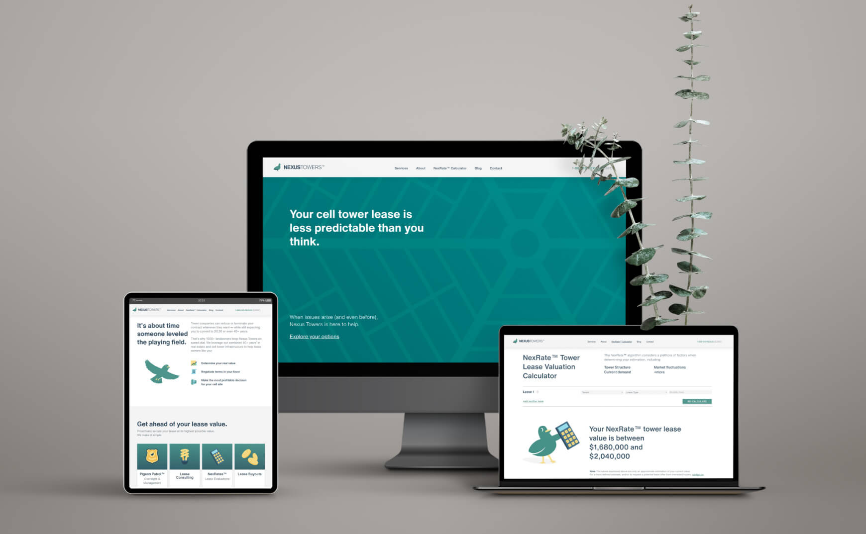
Nexus Towers reached out to us to create a brand identity that was professionally friendly and made accessing information about cell tower leases accessible for their audience of property owners, municipal workers, and real-estate professionals.
Nexus Towers
CLIENT
- Meir Waldman
COPY WRITING
- Mat Wise
STRATEGY & DESIGN
- Sam&Mark
WEBSITE DEVELOPMENT
- Pixel&Byte
SCOPE
- Brand Discovery
- Strategy
- Logo
- Typography
- Color
- Print Design
- Motion Design
- Illustration
- Website Design
LEARNING ABOUT NEXUS TOWERS AND THEIR AUDIENCE
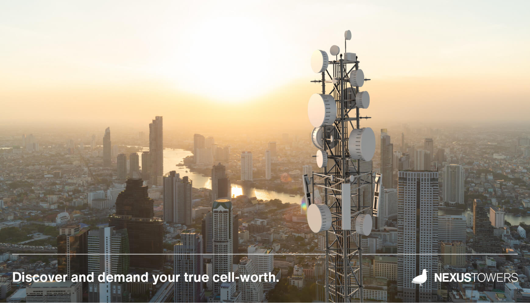
Nexus Towers wanted to stand out by presenting some personality in what is usually a very dry industry. We knew if we could create a visual system that was easy to follow, aesthetically enjoyable, and got right to the point, we could help Nexus Towers differentiate itself from its competition.
BRAND VALUES
Honesty:
- Say what we mean and mean what we say.
Clarity:
- Everything we put out is clear, self evident and without unnecessary complexity.
Personality:
- All brand messaging has that personal touch, giving customers a sense of the great people the Nexus Towers brand represents.
Target Audience Personas

Mike:
35-year-old mid-level property manager living in Boston, MA who has ambitious career goals. He wants the best for his clients because it makes him and his team look good.

Judith:
40-year-old Brooklyn-ite and municipal authority manager. She is passionate about making her community a better place through her work in local government.

Roger:
64-year-old property manager living in Miami. Didn't attend college but managed to have a successful career in real estate. He is a hard-working family man.
LOGO


Taking inspiration from companies such as Geico, Duo Lingo, and MailChimp, we decided to create a mascot logo that we could expand into an recognizable illustration system. After considering several options, we decided to go ahead with the pigeon. Pigeons are the ultimate city slickers, and the original wireless carriers. The Nexus Towers pigeon logo represents resilience, good nature, and local knowledge.
TYPE
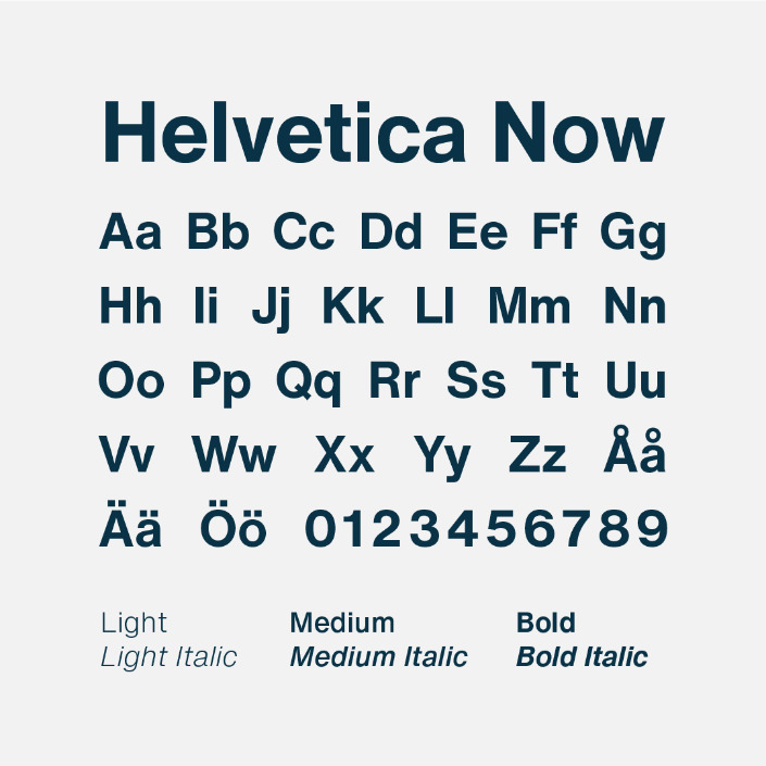
For the brand’s typography, we wanted to contrast our very fun logo with something neutral and modern with a unique connection to Nexus Towers’ home base, NYC. We chose Helvetica Now, a contemporary redesign of Helvetica—the typeface used in the city’s subway system.
COLORS
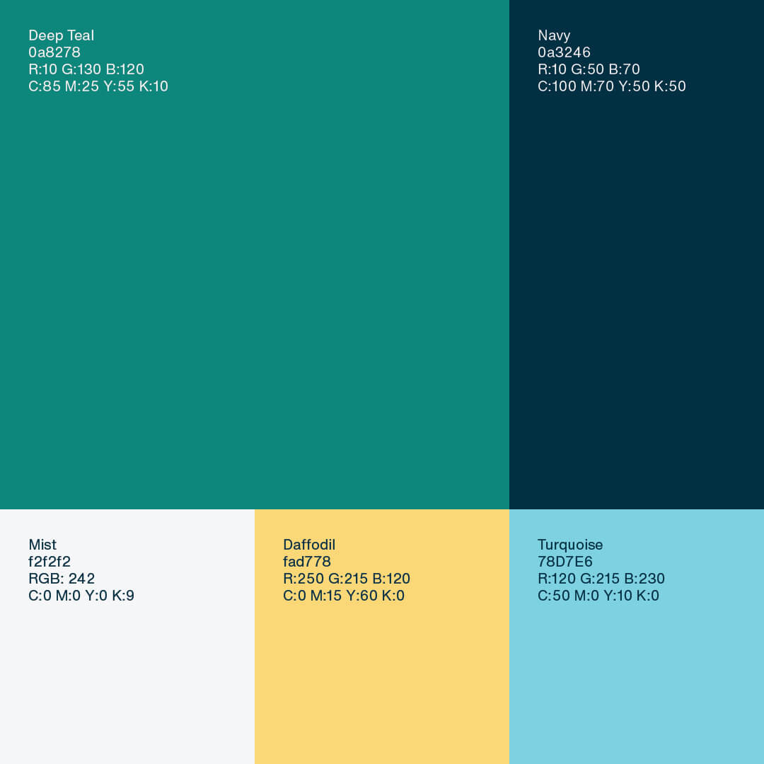
The Nexus Towers colors were chosen to balance friendly and approachable with premium and professional. Teal and Navy evoke luxury, while Turquoise and Daffodil add fun and wit. Mist in combination with white tie it all together.
BRAND PATTERNS
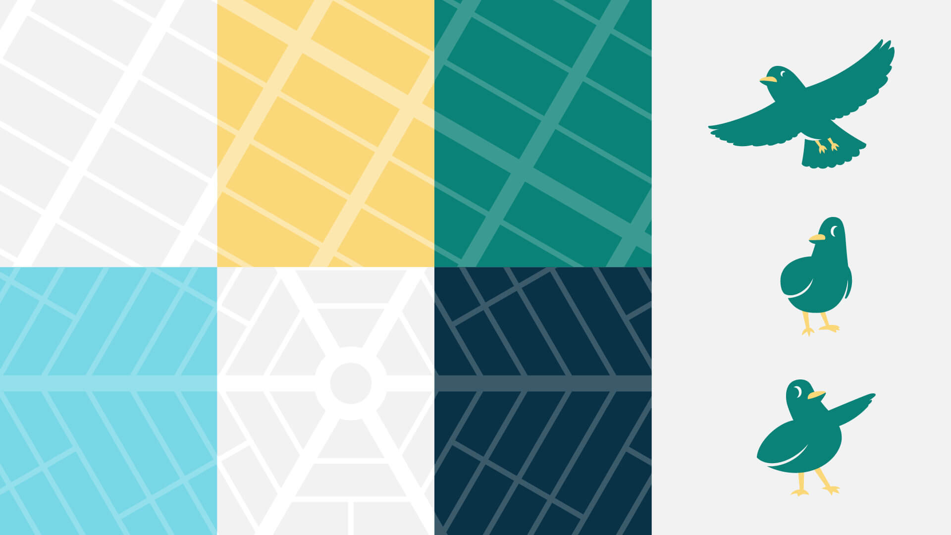
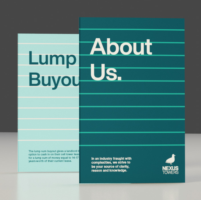
We created 2 patterns based on common city grids. This first is based on the radial city grid, and the second is based on the linear city grid.
MASCOT
Our Nexus Towers Pigeon (yet unnamed) is here to bring the fun! His playful demeanour brings a much needed light heartedness to an otherwise dry document.

ILLUSTRATED ASSETS
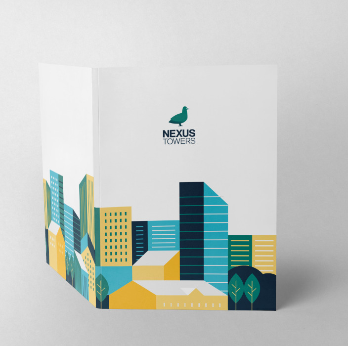
We created these illustrations to be used as icons on the Nexus Towers website and to add some friendly color to their social media banners and business collaterals.
Collaterals
PRINT:
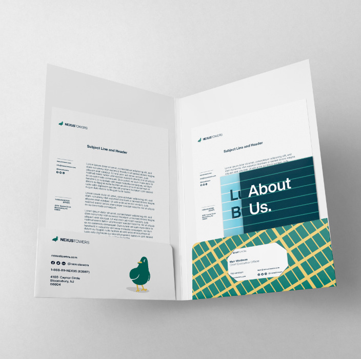
- Sales Folder
- Letterhead
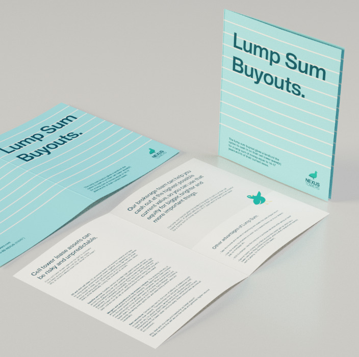
- Brochures
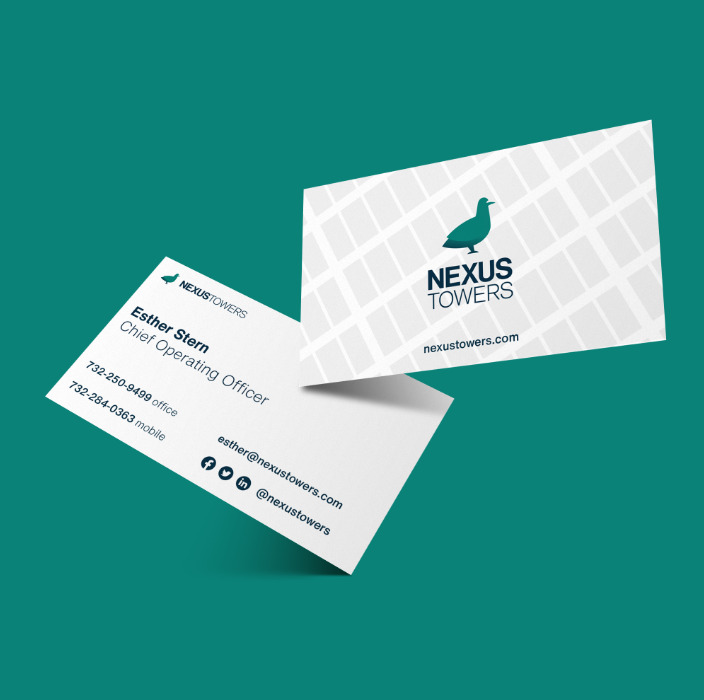
- Business Cards
DIGITAL:
- Email Newsletter
- Email signature
- Web banners
- Twitter/LinkedIn profile pages
- Brand Website
Website Design
The Nexus Towers website features comprehensive pages about who they are and what they do. It also has a Lease Valuation Calculator that clients can use to see the potential benefits of working with Nexus Towers.
